
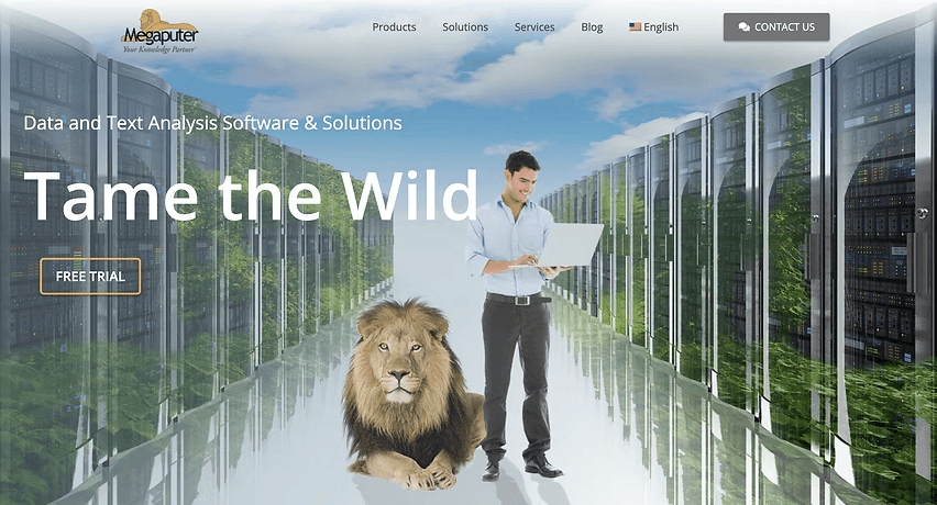
That was the kind of experience users had on Megaputer’s website, take a look at the image below for a quick glimpse.
The 3 main reasons for this frustration were:
Usability Limitations
Complex information architecture and inconsistent design made it difficult for users to navigate and find the information they needed.
The current website lacks a unified visual identity, hindering Megaputer's ability to communicate its brand message effectively.

The text-heavy design and inconsistent design elements, like clashing button colors, made content difficult to navigate, discouraged users from exploring Megaputer's offerings, and hurt lead generation.
To guide the redesign of Megaputer’s website, an extensive literature review was conducted on usability, web analytics, accessibility, branding, and optimization covering over:
06
Books
10
Articles
03
Papers
Books:
The reviewed books focused on the foundations of usability, user-centered design, analytics, and optimization in website development.
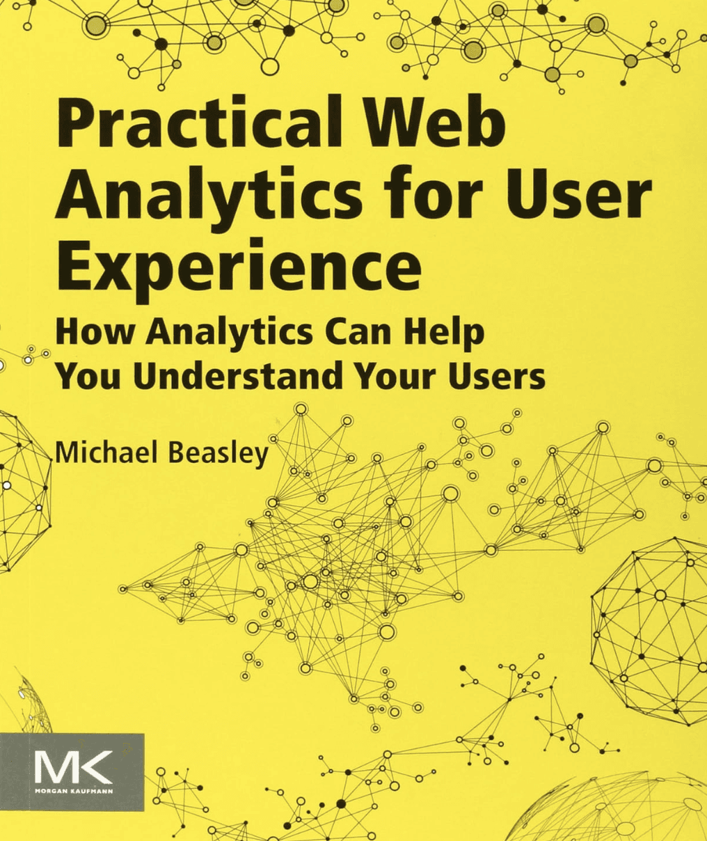
Analytics and UX integration enables data-informed prioritization
→ Beasley demonstrates that analytics only become valuable when paired with user insights. By merging quantitative data with qualitative research, teams can identify high-impact pain points and design changes that truly improve outcomes.
Behavior-driven optimization fuels continuous improvement
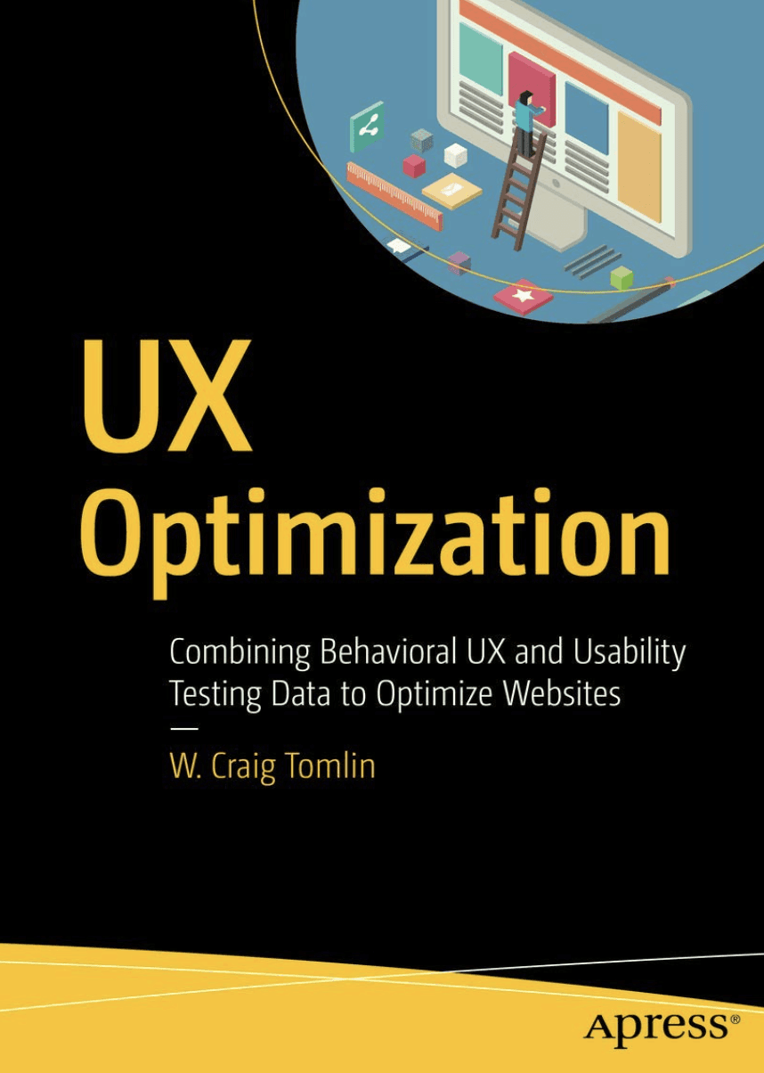
→ Toml reinforces that design is never final. Behavioral UX data, when combined with usability testing, enables iterative refinement, optimizing layouts, interactions, and performance through measurable feedback cycles.
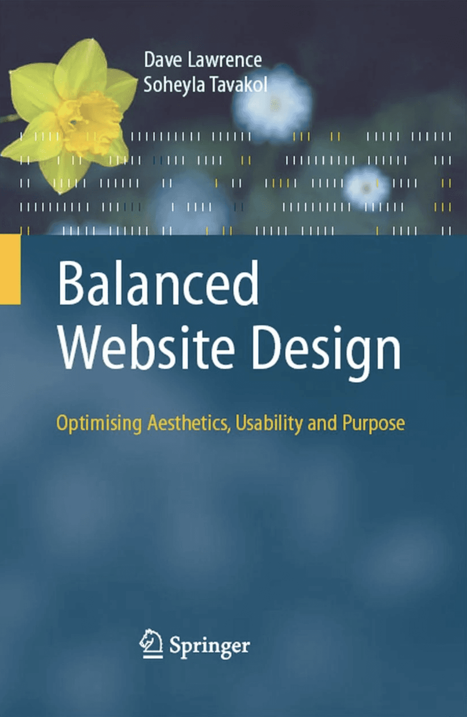
Balanced design aligns beauty, clarity, and purpose
→ Aesthetics should enhance usability, not compete with it. This book highlights the need for visual hierarchy, consistency, and meaningful design intent, ensuring every visual choice supports user comprehension and flow.
Articles:
The reviewed articles explored key principles of scannability, accessibility, SEO, and branding essential elements for improving usability and credibility in digital products.
Key takeaways:
Papers:
The reviewed research papers focused on the relationship between SEO, accessibility, usability, and user engagement in modern web environments.
Heuristic Evaluations
To identify usability gaps in Megaputer’s existing website, a heuristic evaluation was conducted using Jakob Nielsen’s ten heuristics. It revealed issues like cluttered layouts, inconsistent navigation, unclear visual hierarchy, and poor feedback, forming the basis for a more intuitive and consistent redesign.

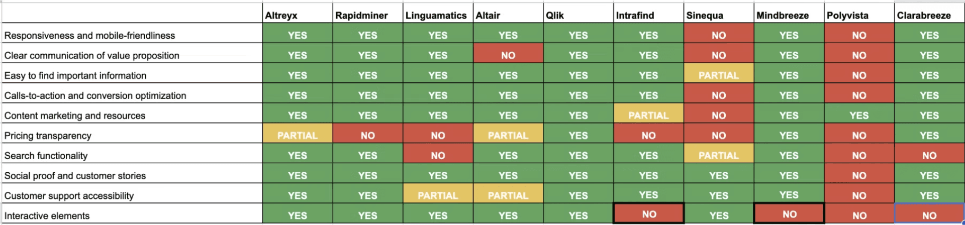
Competitive Analysis
A comparative evaluation of 10 enterprise text analytics platforms was conducted to examine their structural, visual, and informational design patterns. This analysis provided insights into prevailing industry standards and areas for enhancing Megaputer’s user experience.
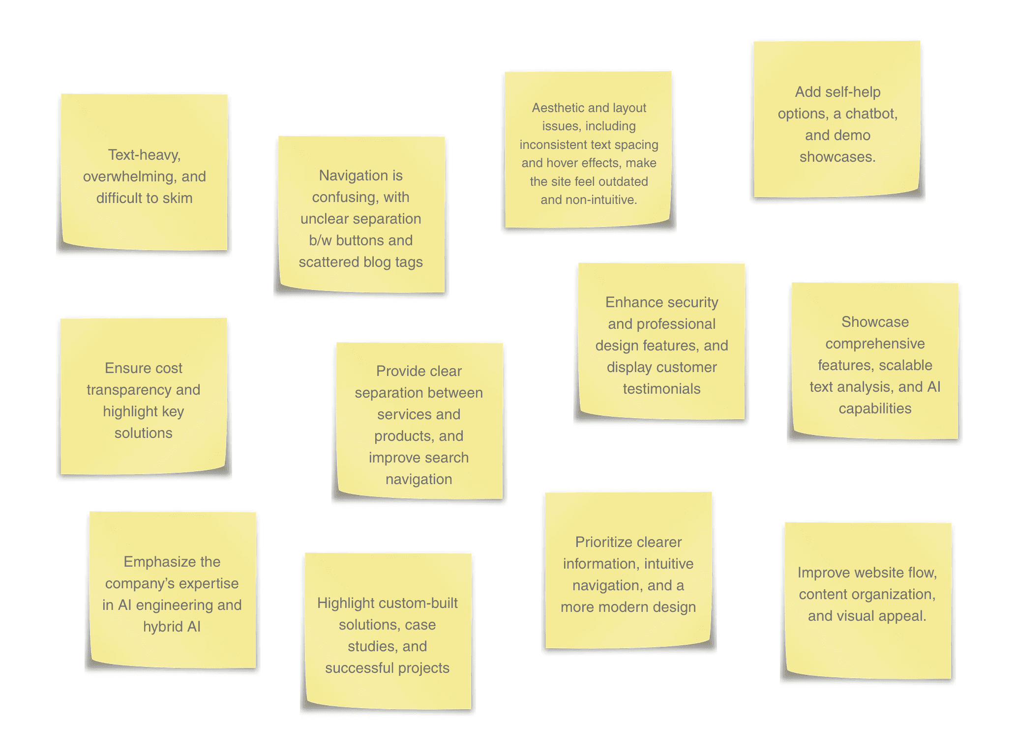
Given that Megaputer’s product serves as an analytics platform for both technical and business users, data analysts, domain experts, and stakeholders were interviewed to capture insights from those who build, interpret, and rely on the analyses.
User Survey - Data Collection
To understand the company from an internal perspective, we circulated a short questionnaire among Megaputer employees. Their responses helped us understand how the company is perceived, what works well, and what aspects of the website need improvement.
These inputs guided us in highlighting Megaputer’s strengths while addressing key usability and design challenges.
Data Analysis
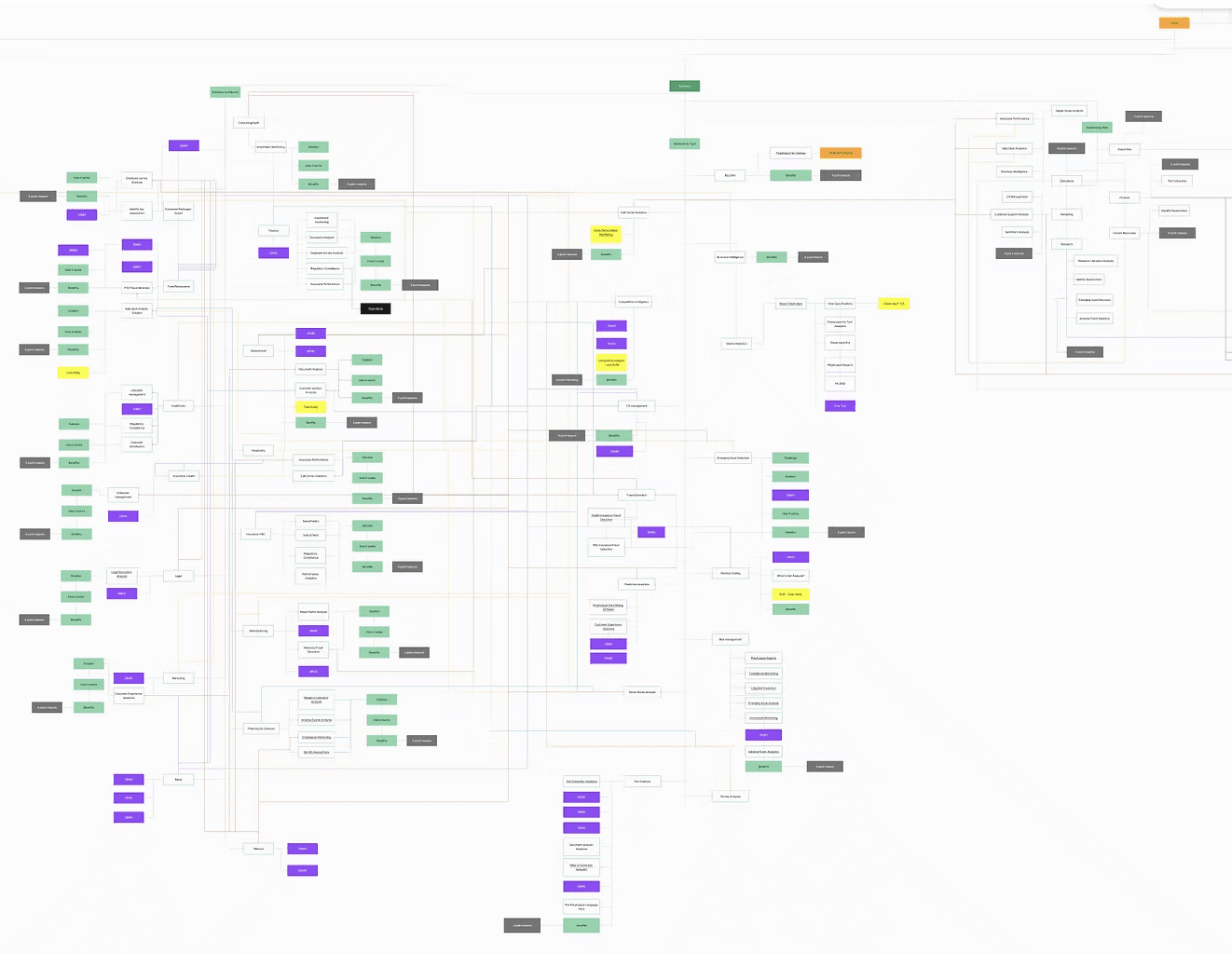
One of our primary tasks was to reverse-engineer the existing website to comprehend its structure and flow. This involved exploring over 100 pages to gain a clear understanding of how the site is organized.
To approach this systematically, we first browsed through the pages and developed a set of metrics to categorize different types of pages and links. By doing so, we could effectively sort the information in 7 recurring themes, reducing overlaps and confusion.
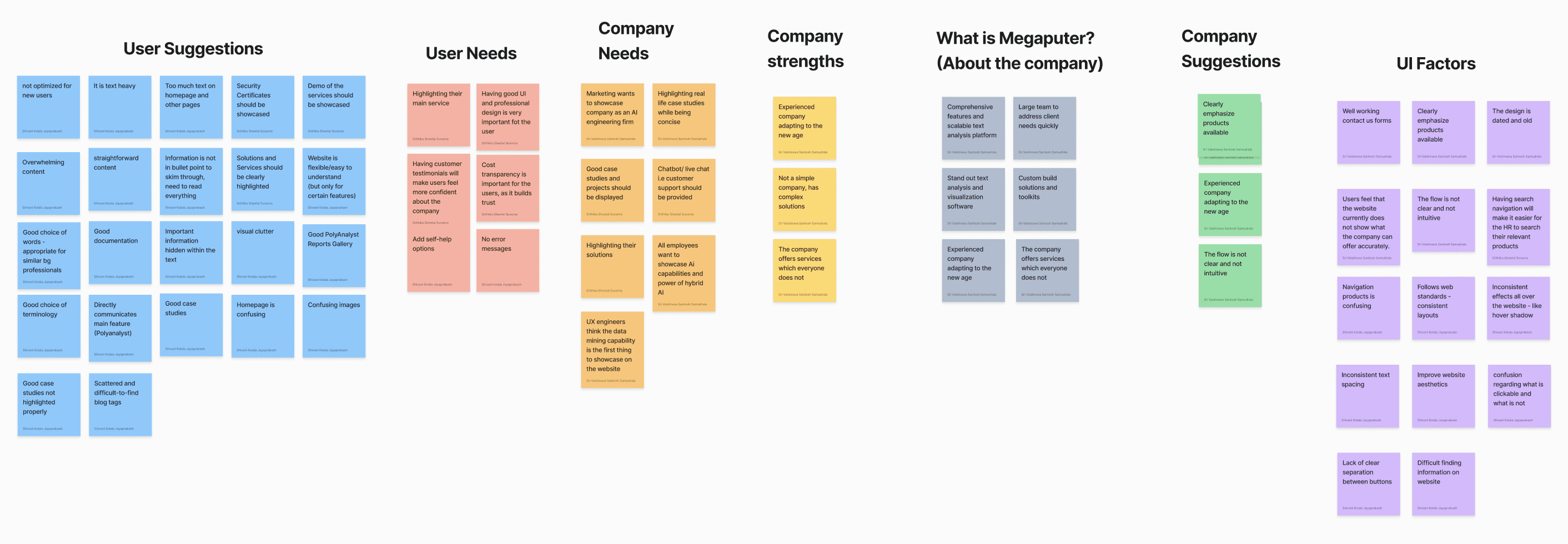
Card Sorting
The Solutions page had one of the most complex structures on the website, multiple pages for a single solution, unclear grouping, and inconsistent terminology. Users struggled to find relevant content or understand categories.
To address this, 4 card sorting sessions were conducted, one with internal team and second with in company users to reorganize and simplify the information architecture.
How did this research help in solve the problem?
Information Architecture
Design System
Golden Flow
After the interviews and card-sorting sessions, it became clear that the website’s information architecture needed major restructuring. To simplify navigation and make the site more intuitive, three key changes were made:
Impact
These changes reduced the total Solutions pages from nearly 80 to 35, clarified the content flow, and made company features easier to discover.
Old- Information Architecture
New- Information Architecture
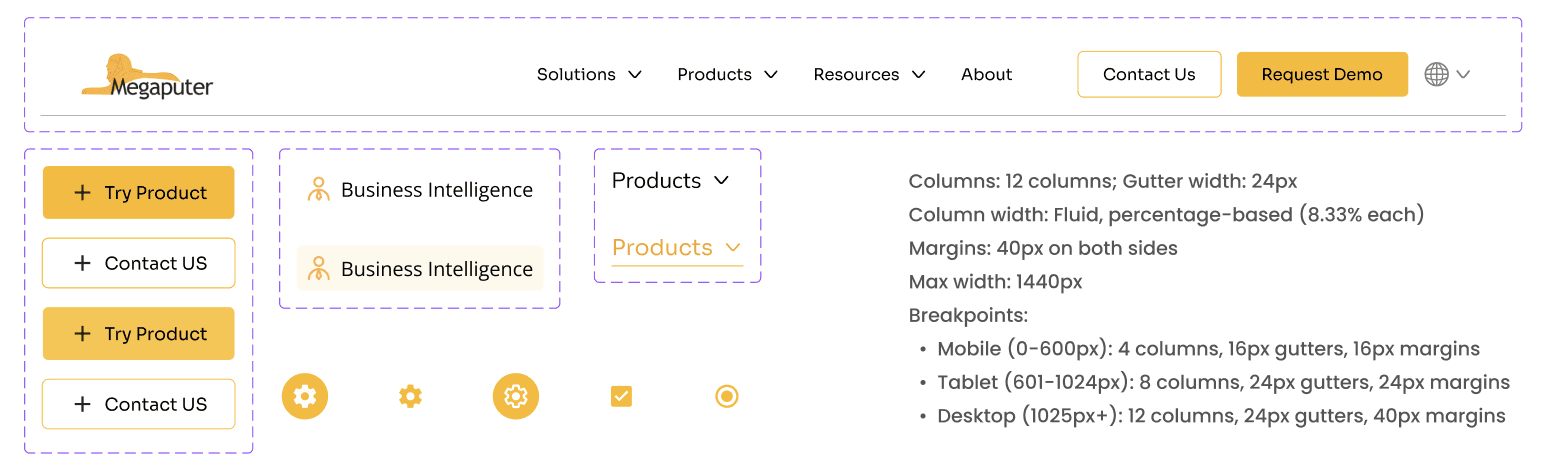
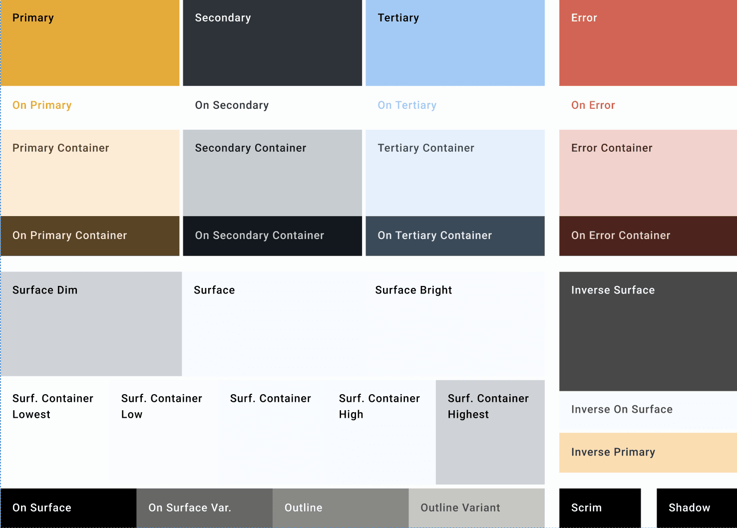
Design System
Once the structure was set, the next step was to bring consistency to how the brand looked and felt.
The lack of visual balance and identity coherence led to the development of a unified Design System, one that ensured clarity, accessibility, and trust across every interaction.
Impact
Before
After
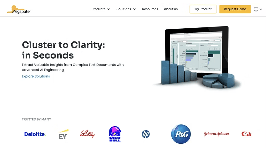
The current homepage lacks clarity and credibility, with irrelevant imagery that distracts users and creates confusion in their experience.
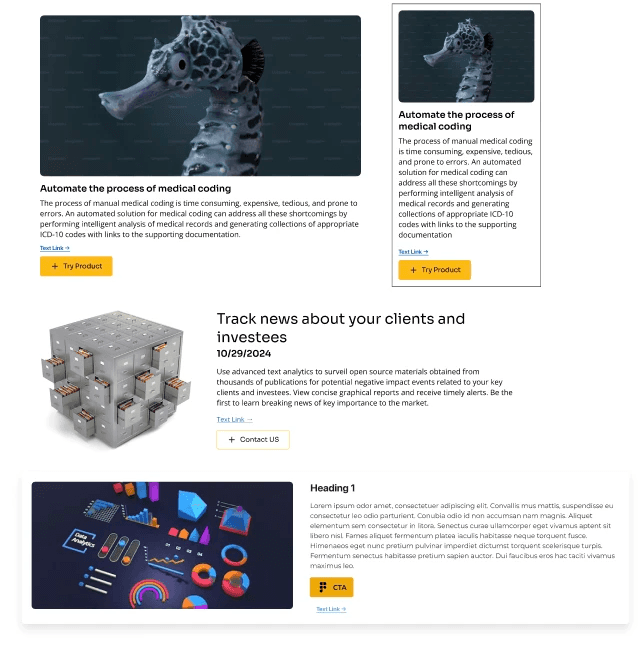
The new homepage strengthens trust through authentic visuals, partner recognition, and a clear, user-focused layout.
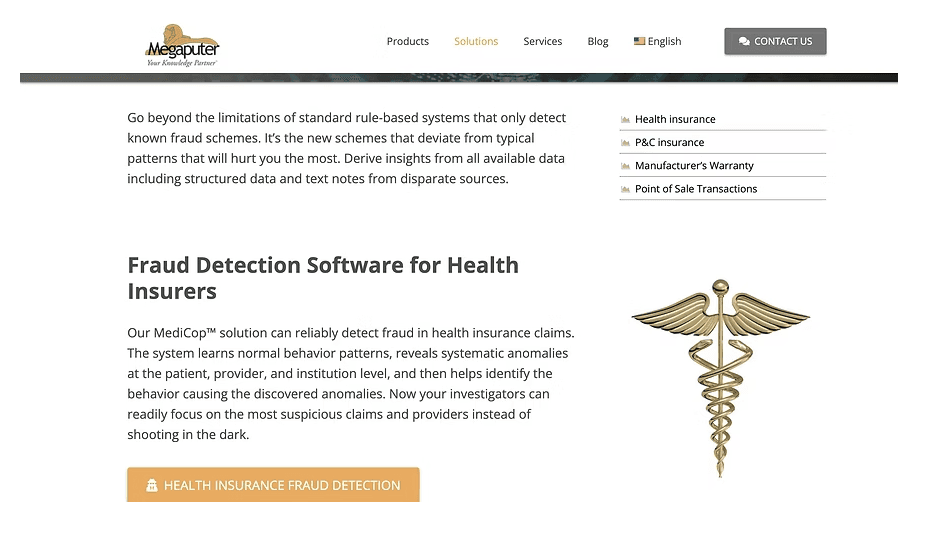
Dense content and multiple redirects reduced readability, making it hard for users to scan the content or identify what’s most important.
The redesigned layout simplifies navigation with clear categories, collapsible sections and concise summaries, allowing users to quickly scan and find relevant details.
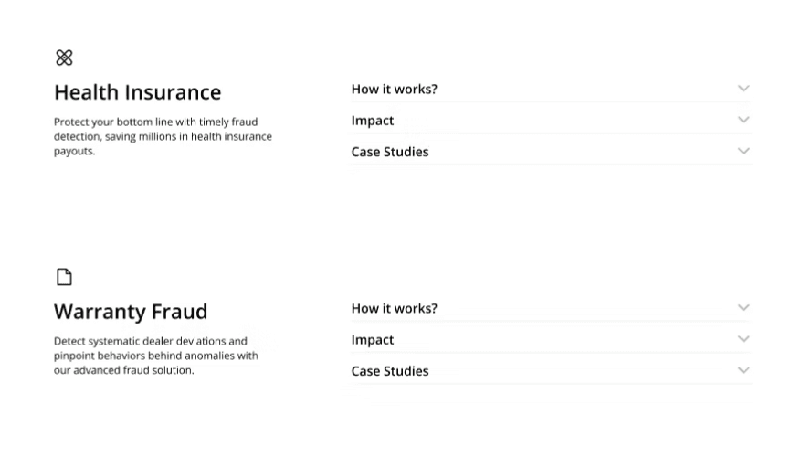
While all the key information is present, it isn’t structured for easy scanning, making it difficult for users to grasp the content quickly.
The improved structure enhances readability, making it easier for users to scan, comprehend, and act on the information quickly.
Golden Flow
The redesign was supported by a redefined Golden Flow, bringing together structure and visuals to guide users effortlessly through each page with clarity and focus.
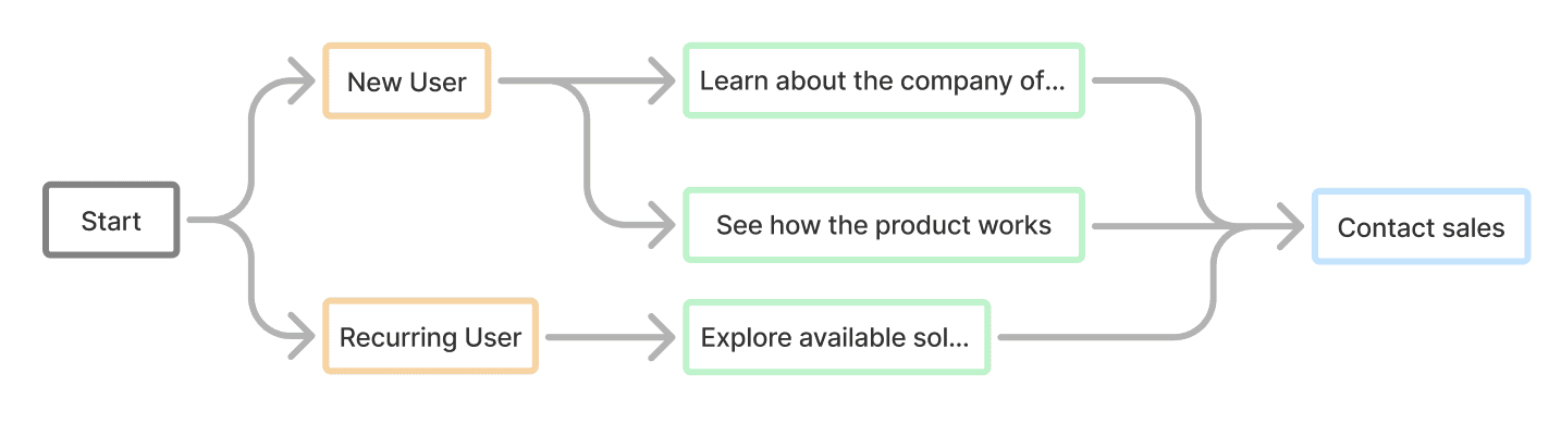
Impact
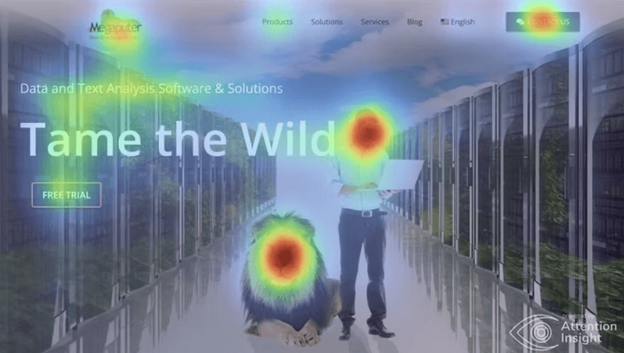
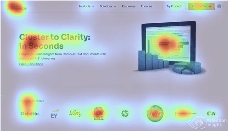
Visuals overshadowed key content, confusing users
Attention on clear information that communicates the company’s purpose.
User Testing
Usability testing was conducted with 6 participants from diverse professional backgrounds to validate navigation, clarity, and overall experience. The sessions revealed key insights that confirmed improved usability, content organization, and user satisfaction.
Learnings
Working with a cross-functional team taught me that being a good designer isn’t just about visuals, it’s about listening, adapting, and collaborating to make sense of the messy parts. Somewhere along the way, I also fell in love with research and explored a lot about building design systems and while I’d like to say I perfected it, the truth is, design systems are vast and there’s always a new curve to learn from.

Click AI Solutions
AI Support System Design

Indiana University | Hands in Autism
Canvas LMS Design - Coming Soon!


